Blogs for Data Processing and Plotting in R
1. Making Fancy Business Data Visualizations within five lines of R code(1): Bar Plots For Market Share Change
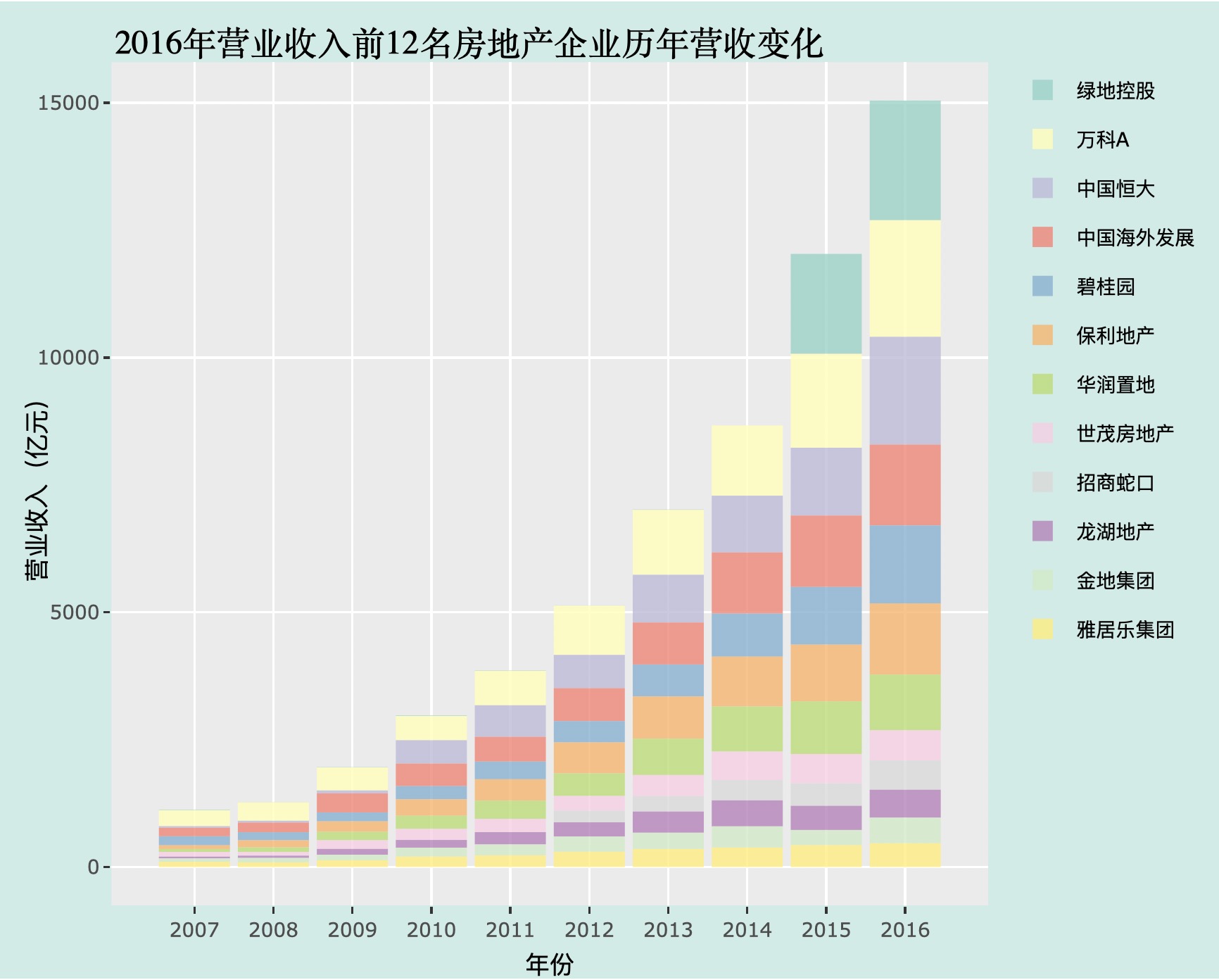
Description: It’s common to ask what are the top 10 companies in a certain industry at a certain year and how are their relative position changing over time. This blog shows how we can achieve this task using within five lines of R code from loading original data.
Link: Bar Plots For Market Share Change
Preview: